Broad thinking creative who obsesses over potential and believes that the best stories are built on experience.
Pas Normal Studios
North American Marketing Manager / Art Director
Pas Normal Studios, a Danish cycling apparel brand with foundation in fashion, focuses on quality and design for the aesthetically-minded rider.
In my role, I established a strong foundation for a European brand’s growth in the US market by cultivating communities in key regions. This was achieved through authentic relationships built on strategic activations, meaningful involvement, and clear communication.
Solstice - Road to Nowhere
Team: Dylan Buffington - Art Direction, Production, Talent • Lucky Day - Production • Warren Kommers - Director
Capturing the essence of cycling is difficult. I wanted to create a picture that wasn't defined by fitness yet told a story based on how it felt—boiling it down to the nuts and bolts, understanding the opportunity, and taking in every moment. Shooting over 24 hours, without stopping, provided its own sets of bizarre possibilities. With the array of unique assets that we captured, the team created something that set itself apart.
I worked closely with Pas Normal to make a video that resonated with the brand and stood out as a bold visual statement. The concept was developed using references pulled from outside industries and creative disciplines. The result was an intense visual journey that the entire team was proud of. It’s best watched big and loud.
Subjective Landscapes - Road to Nowhere
Team: Dylan Buffington : Art Direction, Production, Talent Lucky Day : Production • Dylan Buffington : Director
We wanted to take a moment to listen to one of our veteran riders on how she correlates her creative side with her experience on the bike. Creativity has always been at the core of the brand, and showing these sides of our community built trust and depth to the US community of cyclists. Displaying her experiences with the backdrop of Colorado continues to support how the European based brand was truly international.
Developing these brand moments was crucial in building authenticity. We hosted a video launch that was centered around a 100+ person group ride around the Bay Area and an in store activation at our flagship store. We had also brought Krysten to events in key markets to connect with riders from other communities.
Essential Collection Photoshoot
Team: Dylan Buffington - Art Direction, Production, Talent • Jake Stangel - Photographer • Simon Christiansen - Pas Normal Contact
Cycling apparel typically falls into the category of performance athletic apparel. To show how Pas Normal differentiates, we set out to split these roads and establish a sense of style and color. The same way someone would curate their look before going out for the evening, we show the same attention to detail, quality, and aesthetic on the bike.
When shooting a scene where movement is critical, the production takes an alternative approach of creativity in order to have a dynamic result. Having the photographer follow the riders on the back of a motorcycle meant the viewer sat at the same viewpoint as the cyclist, creating an incredibly compelling image.
LeMond
Creative Director • Designer (Contract)
The LeMond Brand is a household name in the cycling community. The American three-time Tour de France winning icon, Greg LeMond, has used his brand to leverage his innovation multiple times in the last four decades.
A six-month contract set a tight timeline to create and direct the re-launch of the LeMond brand. I defined a strategic process for the creative team while rebuilding a brand from scratch. Setting the groundwork and handing off a clear vision and path continues to lead LeMond to success, selling bikes around the world.
Brand Relaunch
Team: Dylan Buffington - Creative Director, Graphic Design • Geoff LeMond - Web Developer • Adrian Flores - Copy, SEO, Marketing
I set out to shake the industry with two new category-defining bikes under a globally known brand for the first time in a decade. New brand identity, a high-end customer web experience, and fashionable bike design made LeMond easily distinguishable from the competition.
My main goal was to make sure the creative was timeless and cohesive, speaking back to the brand's history yet setting it apart as a new kind of bike company, leading in design and customer experience. While working closely with the product managers and executives, it was essential to keep the price of the bikes reasonably affordable, making the brand more inclusive.
The Identity was inspired by logos seen in Formula 1 throughout the 1980’s that dominated the era. A bold mark with high contrast, with a push of color set LeMond apart from the competition.
Specialized Bicycles
Lead Creative • Art Director • Designer
Specialized is a company that is synonymous with cycling itself yet also leads the industry in innovation and performance. The brand has owned monumental moments in cycling history with its athletes and products. The marketing team is world-class and constantly sets new precedents in diversity and inclusion in cycling.
I started at Specialized as an Industrial and Graphic Designer, but always keeping my hands close to the physical product. Within two years I transitions to the Global Marketing team to flex my incredible strong sense of story telling alongside my creative background. I became a Lead Creative, building out concepts, art directing campaigns, and highlighting key brand moments. My work quickly became a driving buzz and built increasing excitement for design and experiences, both at Specialized and in the cycling community.
Tokyo 2020 Olympics 2018
Team: Dylan Buffington - Concept, Creative Direction, Designer • Kayla Clarot - Graphic Design, Production • Erik Nohlin - Project Manager
The Olympics is a moment to innovate, empower athletes, and elevate brands. For a short moment every four years, design has the opportunity to perform just like the athletes. In the previous Olympics, Specialized had done a colorway for the bikes. For the 2020 events, I wanted to design an ecosystem.
This was an initial Special Teams Project. I built a process to pull talent from throughout the company to execute on an individual brand moment. I managed and creative directed the team through concept, design, and production, paving the way for marketing and execution. The result was an extremely robust design exercise that set new precedents for the cycling industry.
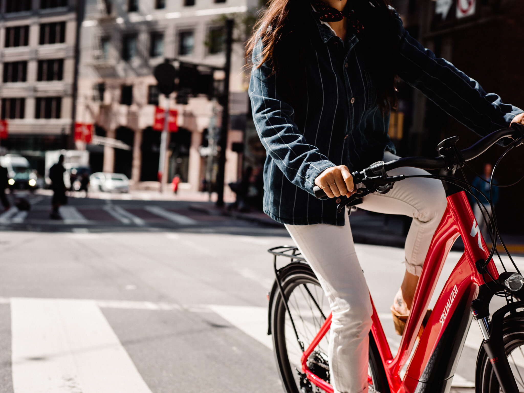


The Specialized "Core" category had fallen through the cracks with outdated content and messaging, leaving it to feel like an outlier compared to the superior road and mountain groups. A new approach and a modern understanding of the “Core” rider was crucial in rebuilding a community of diversity and in turn a more approachable "Active" category.
"Active" means movement. It doesn't mean workouts; it doesn't mean challenges. I wanted to assure that riders never felt pressured to perform or to be “fit”. One of the essential components was to set up a shoot that communicated how a bike could fit into the riders everyday lifestyle. Creating this space expanded the brand to an exceptionally broader community.


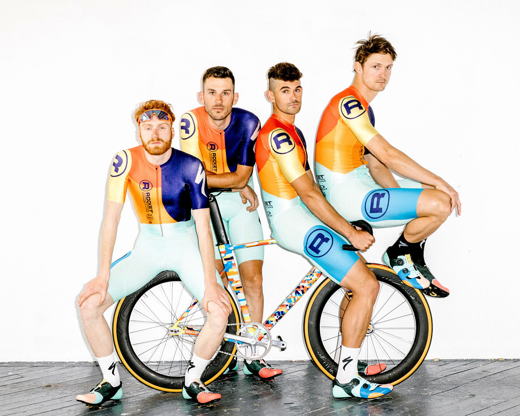


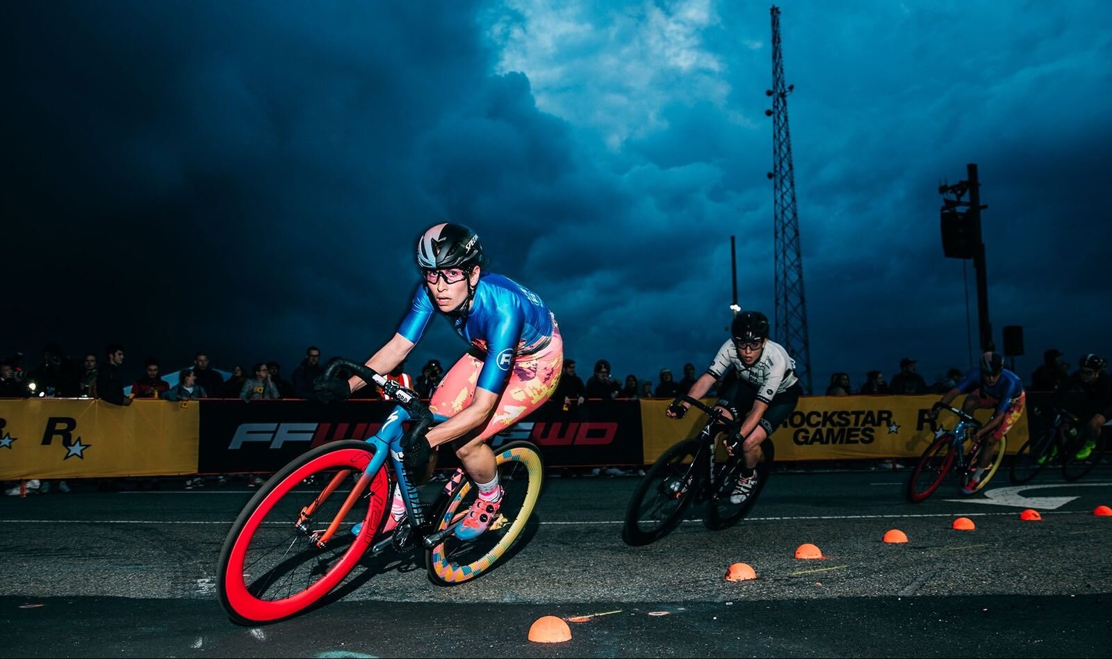

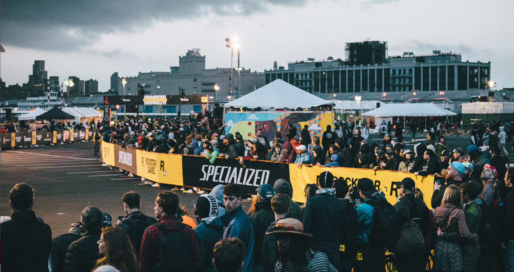
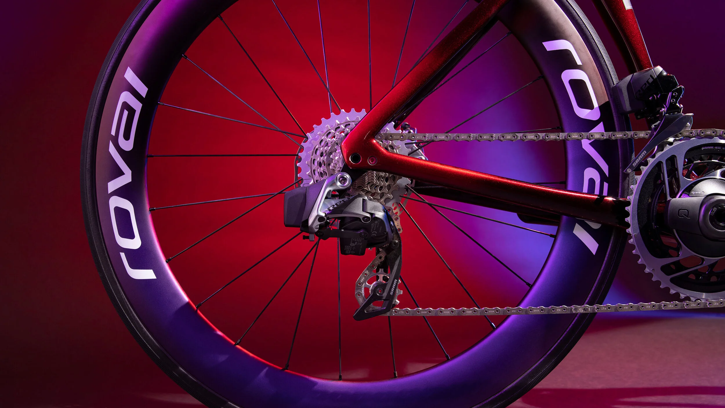
Bike racing doesn't always have to be serious. Some of the most iconic moments in sports happen when your expectations change. The rebellious style of racing called fixed gear criterium became the perfect stage to challenge the status quo of design in sports.
The design of the bikes became a metaphor for how the team acted and performed. Excitement, positivity, inclusivity, showmanship, and most importantly, fun were attributes that drove this team to success. Manage the product and design, I was able to create a holistic space and build out an environment that allowed anyone interacting with the team to feel as included as the racers themselves. The Specialized Rocket Espresso set new precedents for Specialized and broke handfuls of records. To say it was successful was be an understatement.
Specialized Enduro Launch Campaign
Team: Dylan Buffington - Art Direction, Marketing• Collin Chappele - Photography • Ian Schiller (Sabertooth Productions), Concept, Director
Sometimes creating an ambiance for a product is more vital than writing a tagline. The Enduro had not been redesigned in nearly a decade and had caught a reputation of being slow and heavy. Repositioning the fast and light newly engineered frame started with changing what Enduro means.
A week before we left to shoot, I was tapped on the shoulder to steer the project to meet brand coheasivness. My goal was to drive a scalable campaign that aligned successfully with the Specialized mountain bike strategy. Throughout this project, I worked side by side with the director and photographer to achieve these goals. Post-production, I built the full web experience, creative directed the launch campaign and an event.
Specialized in print
Team: Dylan Buffington - Art Direction, Graphic Design • Janeen McCrae - Copy
Rouleur has a reputation for being a high-end well-designed cycling magazine. With a keen sense of what's essential, sans the typical advertisement riffraff. They relied heavily on the trust and support from Specialized Global Marketing team to create like-minded full spread ads.
Since advertisements in print can get lost on viewers page after page, the challenge was to create a series of ads for products that a reader would undoubtedly recognize as Specialized. Success was using a consistent layout and style of messaging that was easily digestible at first glance and highlighted the high-quality content.
Logos and Marks
A few logo marks I had produced for the brand that covered products, campaigns, and collections.
MASH Transit
Graphic Design
Mash is a subculture brand like no other. Like Thrasher or the original Bones Brigade of the 80s Skate scene, MASH is the focal point of urban fixed gear cycling. Founded by a commercial photographer documenting his friends riding these unique bikes in the mid-2000s, he soon realized that what he captured was the birth of a culture in cycling no one was expecting.
I connected with MASH in 2009, assisting in the build and opening of the first brick and mortar. I soon became a graphic designer creating shirts, products, and supportive web assets for the brand. As MASH grew, I assisted in managing and took on larger-scale projects.
MASH 10 Year Anniversary Book
Team: Dylan Buffington - Graphic Design, Production • Garrett Chow - Art Director • Mike Martin - Creative Director
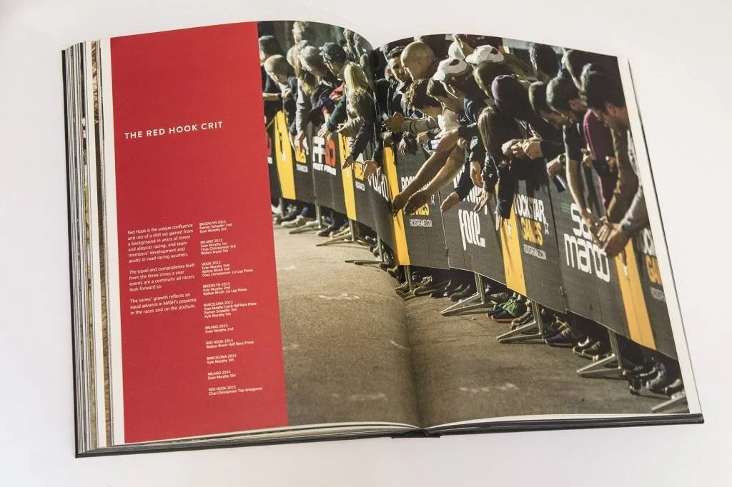
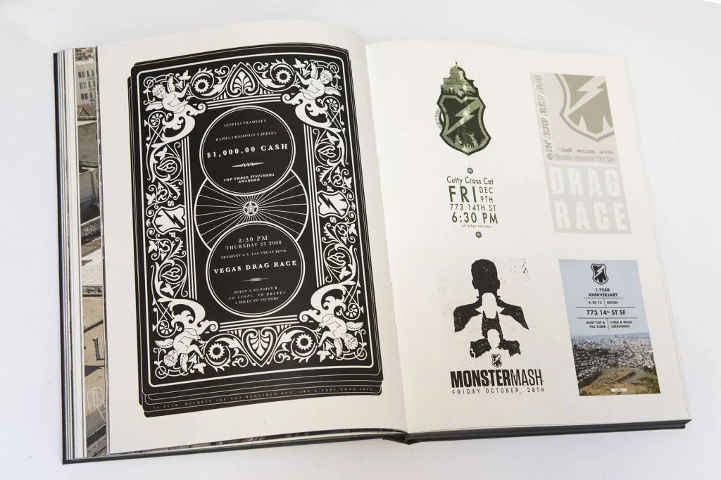
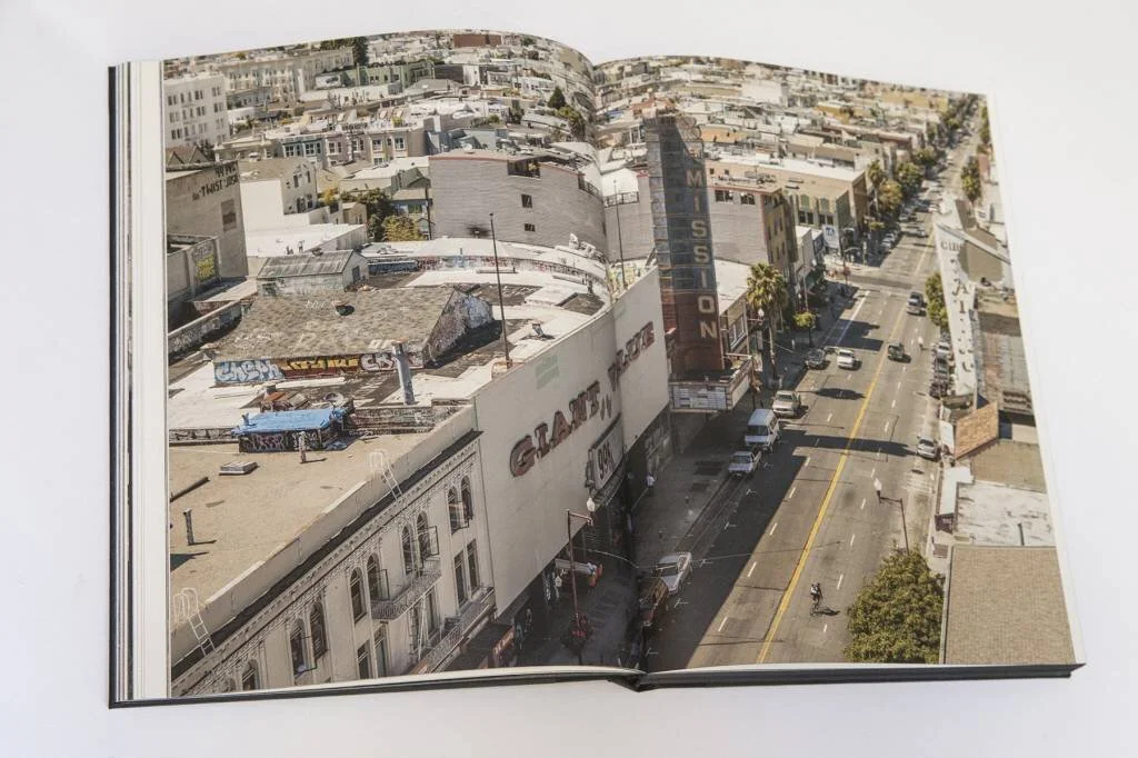
As MASH came into form in 2006, the group of cyclists documented each other riding on the steep hills of San Francisco, creating a global phenomenon in cycling. Ten years later, it became apparent that it was time to organize and showcase the moments that defined the brand.
The 355-page book highlighted the era, artifacts, athletes, products. I worked with my colleague Garrett Chow who directed the formatting of the book. I put myself through a crash course of book design, typography, typesetting, and book production to execute the overall project. The book was built in roughly eight months and completed at the end of 2015 and was designed to pair with a world tour premiere of a full-length film.
Thanks


